Logo - change or keep? (retitled with poll added)

What should we do about the logo?


  • Total voters
    59
  • Poll closed .

Bricklayer

Don't Make Me Use The Bat
#61
so to sum up thread:

Jersey for wusses:


Logo for wusses:


Logo for badasses:


Logo for deeply disturbed toddlers who's parents sleep with the door locked:


P.S. I like the idea of passing out lances and other medieval weapons at the door. Talk about your homecourt advantage -- how's 18,000 people armed with swords and flails? Bet we'd get some nice home cooking that way.
 
Last edited:

Capt. Factorial

trifolium contra tempestatem subrigere certum est
Staff member
#63
Tough poll. I voted to update the current one - a tweak or two every once in a while can't hurt, but I like the general thrust of the logo and I'd be OK if we kept it exactly the same.

But that's not what I think will happen. I suspect that we will get a major overhaul to complete redesign of the logo for the opening of Golden 1.
 

hrdboild

Moloch in whom I dream Angels!
Staff member
#64
Our logo does look a little dated, but then it should look dated it's 20 years old. And that's kindof the point with sports logos -- keep them long enough and they become classic. And the basketball gimmick is a long-standing tradition. Yeah it's a little goofy, but why upset the basketball gods? That being said, I wouldn't be opposed to a logo change either provided it's an improvement. And they keep the basic colors we have now.

Now the uniforms, that's another issue entirely.


A lot of NBA uniform designs are embarrassingly bad so I don't think ours stand out particularly, but they're just kindof blah. The funky thing with the collar has never looked good and the rest is as generic as it gets.* Paste team font here, paste goofy number font here, paste bizarre tusk-shaped half stripes here. The logo looks like it's just slapped on the shorts because it had to be somewhere:


It would be great if we came up with something a little less obviously derivative of what the current trend is and instead be more forward-thinking.

Then again, that's probably what these teams thought when they came up with these monstrosities:


I do love that new Hawks logo though. Speaking of which, here are the updated logos for the coming season:

Link to save space

For my taste the Sixers, Hawks, Bucks, and Warriors hit it out of the park with their new logo designs. All very classy and minimalist. Well the Bucks one with the shoehorned M shape is a tad iffy, but I like the color change and it's at least an improvement on what they had. They all have an old-fashioned baseball vibe that I dig. Look at all those circles. Baseballs are circles, basketballs are circles. It just makes sense.

That said, the Wizards and Raptors are improved but still bad. The Wizards should just stick to the hand logo instead, which is kitchy and awesome.

The new Nets highway sign placard and simple black/white color scheme seemed too minimalist to me at first, but it's actually grown on me a lot. It fits the new aesthetic very well. You can see the "Yankees" design influence there in the uniforms as well. They wanted something that even non-sports fans would buy and wear.

The Spurs, Suns, and Blazers still look great. Retro but aging well. Same for the Pacer "P" logo I've always loved ( a true ageless classic) and the Memphis Grizzley Bear.

Actually, seeing the old and new logos together here, even the Lakers logo is starting to look dated to me. The next generation of basketball fans don't even know what "Showtime" is. I have a feeling they're going to stick with it no matter what, similar to the wonderfully tacky Knicks and Pistons logos, because of history but less iconic franchises (Nuggets, TWolves, Heat, Magic, Kings) might want to consider moving out of the 90s.

Also, the "you're clearly trying too hard" achievement in logo design can be shared equally between the Mavs, Pelicans, and Hornets. It doesn't matter how many extra lines and flourishes you add to it if the basic design itself is mediocre. Look at the Hawks logo again. Clean, simple, gets the job done.

Then again, the Boston Celtic logo is the corniest of them all and it still works because the uniforms are flawless. So maybe the logo itself doesn't matter much if the overall look is strong.

Wait, what was the question again?

* Okay, technically the interchangeable new uniform designs for the Hornets, Bucks, and Sixers are as generic as it gets. The classy minimalism of the Celtics uni is apparently a lot harder to pull off than you would think.
 
Last edited:
#65
The classic logos all look the best. These new logos all look ridiculous. Like amateur arena league football bad. Why is everyone always so worried about looking dated or needing the logo to look bad ass? They just look lame to me.

The iconic sports teams have kept their looks for years. Lakers, Knicks, Bears, Packers, Yankees, Red Sox, etc. Even the Niners went back to their old look that just looks way better than the "updated" version they had for over a decade. Look at Nascar. The cars used to be painted one or two colors. You could point out the Miller, Bud, GM, Valvoline etc cars from a mile away. Now the paint jobs are all crazy and you can't tell what car is what unless it's front and center.

Sports just need to keep it simple. The Knicks have nothing intimidating about them from their logo to their jerseys but they were pretty intimidating with Oakley and Mason back in the day. I just don't see the need for all this junk. Sleeves, crazy designs, "bad ass" logos, ridiculous team names....it's all amateur hour looking. Stick with the classic looks that are easily recognizable.
 

Bricklayer

Don't Make Me Use The Bat
#66
Tough poll. I voted to update the current one - a tweak or two every once in a while can't hurt, but I like the general thrust of the logo and I'd be OK if we kept it exactly the same.

But that's not what I think will happen. I suspect that we will get a major overhaul to complete redesign of the logo for the opening of Golden 1.
A suspicion I harbor too.

Which is why having learned my lesson with this ridiculous outfit I plan to start hammering on them early and often, running polls, forwarding results and generally doing everything I can over the nest season to scare them off from more noveau owner B.S.. Tough for a tech geek owner to swallow, but newer isn't always better especially in matters of tradition.
 

hrdboild

Moloch in whom I dream Angels!
Staff member
#67
The classic logos all look the best. These new logos all look ridiculous. Like amateur arena league football bad. Why is everyone always so worried about looking dated or needing the logo to look bad ass? They just look lame to me.

The iconic sports teams have kept their looks for years. Lakers, Knicks, Bears, Packers, Yankees, Red Sox, etc. Even the Niners went back to their old look that just looks way better than the "updated" version they had for over a decade. Look at Nascar. The cars used to be painted one or two colors. You could point out the Miller, Bud, GM, Valvoline etc cars from a mile away. Now the paint jobs are all crazy and you can't tell what car is what unless it's front and center.

Sports just need to keep it simple. The Knicks have nothing intimidating about them from their logo to their jerseys but they were pretty intimidating with Oakley and Mason back in the day. I just don't see the need for all this junk. Sleeves, crazy designs, "bad ass" logos, ridiculous team names....it's all amateur hour looking. Stick with the classic looks that are easily recognizable.
I agree to a certain extent. Get the logo right and then leave it alone. I disagree though about the majority of NBA teams getting these logos right so far. Many of those iconic baseball logos evolved over nearly a century to what they are now. The NBA, unfortunately, went through most of it's growing pains during decades of questionable aesthetic taste. I don't think you should be married to an idea just because it's got a little bit of history behind it. Atlanta and Philadelphia managed to update their logos while paying homage to their past and the new logos look way better than the ones they replaced and a lot more likely to stand the test of time.

Compare:


Those 90s logos look like the kinds of art design everybody used to make in the primitive early internet days when we hadn't collectively realized yet how tacky clip art looks. Both new logos are a vast improvement. I don't think every logo should be a generic circle but something simpler and cleaner would be more appropriate now. If I'm supposed to wear that thing on a hat or a jacket, I don't want it to look ridiculous. Sometimes you just get so used to things being a certain way that the cartoonish nature of it only dawns on you in retrospect. Admit it, some of these 90s logos look really bad today.
 
#68
SOME of them do, yes, but they always DID, even back then. Some of them told a nice story. Call me old fashioned (or just old, whatever) but I don't think those new Logos are exactly ground breaking, circle (actual ball optional) city name, cartoon graphic. Please don't let us be reduced to the same look as everyone else just for the sake of change.
 

hrdboild

Moloch in whom I dream Angels!
Staff member
#69
Here's what I mean by forward-thinking uniform design. These new Cavs "retro" jerseys are a work of art:


Subtle but distinctive font selection. Simple three stripe piping. Great contrasting color choices, no unnecessary third accent color.


Similarly clean and sharp looking on the back. Note the use of the simplified "C" logo above the name.


Very cool customized "All for one. One for all." branding inside the collar.


Here's a close-up of that "C" logo. Also there's an interesting textured flourish on the numbers which adds a little new-age contrast to all the retro styling but doesn't distract in game action.

I love everything about this. This is jersey design done well.
 
Last edited:

hrdboild

Moloch in whom I dream Angels!
Staff member
#70
SOME of them do, yes, but they always DID, even back then. Some of them told a nice story. Call me old fashioned (or just old, whatever) but I don't think those new Logos are exactly ground breaking, circle (actual ball optional) city name, cartoon graphic. Please don't let us be reduced to the same look as everyone else just for the sake of change.
These logos both happen to be circular. That's a classy look but it would be boring if everyone did that. I think the Trailblazer pinwheel, Pacers P, and Grizzly Two-Tone Bear head are all equally iconic without resorting to the same cliche. The point is to make a statement with something simple, clever, and sharp looking but don't overdo it. Think Nike Swoosh. And the Atlanta Hawk logo is brilliant in it's simplest form, no basketball or text wrap needed:

 
#71
I always like simple and clean on the jerseys, hence the reason I loved our old road blacks the best. That's not the same as our logo. Put the crown on the back of those old road blacks and call it a day.
I asked my daughter what she thought that logo was, she said it was either Pac Man or some sort of bird, maybe? She is 20 and obviously does not watch basketball. I agree it is simplistic and clean and I like it MUCH better than some of the other attempts I have seen.
I just worry, a LOT, that they will come up with something just awful (cough, clippers, cough) Judging by other teams attempts at 'modern' I don't like our chances. Leave well enough alone.
Have at the jerseys, as long as you stay away from gold, shimmery or otherwise=)
 
Last edited:

hrdboild

Moloch in whom I dream Angels!
Staff member
#72
I was inspired to take a crack at it, and here's what I came up with...


(1) Heritage Kings Logo (1985-1994):

I never liked this logo much. It doesn't really look like a crown and the font brings nothing to the table.
I wanted to take some kind of design element from this logo though to pay respect to the history of
basketball in Sacramento and I actually do like the swooping curve motif used on the bottom here
because it makes me think of the junction of the Sacramento and American rivers.


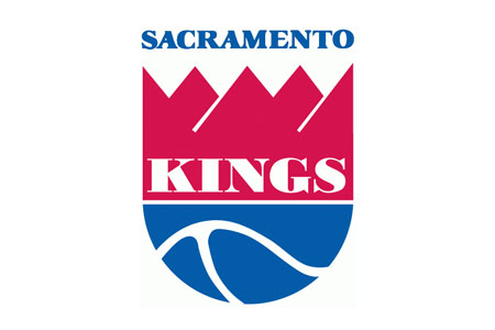
(2) Clip-Arty 90s Kings Logo (1994-Present):

This isn't a bad concept overall, I liked it a lot when it first came out. The color change alone is a huge
improvement and the symmetry of it is nice. The Sacramento scroll in particular looks kindof tacky to me
now though and it doesn't say anything about the city of Sacramento. It's a surface level concept without
a lot of inherent meaning. Also I think it's time to retire this particular block lettering and come up with
something fresher.


(3) Rough Concept Sketch

The first thing I did was extend the crown to make it look more like the modern interpretation used on the
Kings website and less like a famous member of the Simpsons. I also thought about extending the basketball
shape asymmetrically to make it look less rounded and more like a kind of shield. I was looking for an iconic
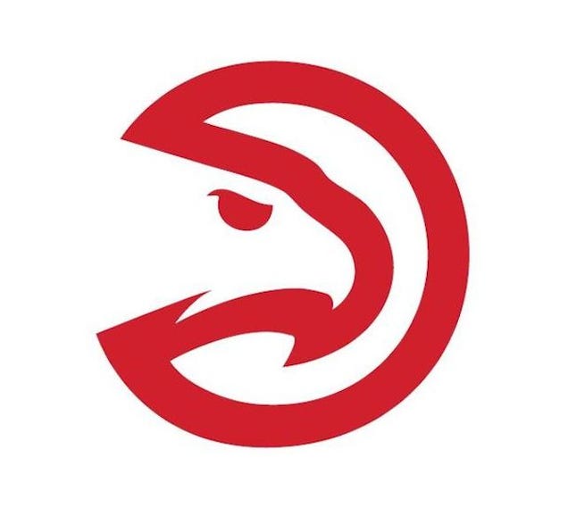
image like the Atlanta Hawk logo that is instantly recognizable and uncluttered with text so no need for the
redundant "Kings" letterhead on there or even the city name. I also added the stars for symbolic purposes -- more on that later.


(4) Detailed Colorized Rough Concept

I'm not a graphic designer so this is probably about as far as I can take this concept myself. It's still
pretty rough. I wanted to keep the colors simple, no silver accents just purple and black. I also decorated
the crown with facets and angles to make it look a bit like a city in perspective. It echoes the look of the
new arena a little bit as well in silhouette. I opted to round off the ball again here to make it look more
like a face, though I'm not sure if I like that better or not. The asymmetry of the first concept appeals to me as well.

So what's going on here?

Well it's still a basketball with a crown on it. That's the surface level.
The basketball itself is shaped like a head as well so it sortof looks like a King with a crown on his head too.

One level deeper, I said the stripes of the ball symbolize the two rivers that conjoin in downtown Sacramento
so this is an image of a city growing up toward the stars from a river basin below.
It's a promise of what the future holds for the region.

Thirdly I wanted to make some kind of a statement about what this team symbolizes. Why would a player
be proud to represent the Kings and Sacramento? What kind of shield would they proudly wear into battle?

Basically I think what we're trying to sell as a franchise, as an identity, are three things:

Unity, Tradition, and Loyalty.

The Kings are a family, we stick together. That's unity. If you play for the Kings you're going to be a part of a
winning tradition. You're going to know that this city fought hard to keep basketball as a part of it's future and
you're going to enjoy the undying loyalty of Sacramento fans. So that's why I put the stars on there.
The one on the left symbolizes Unity, the one on the right symbolizes Loyalty, and the one in the middle
symbolizes Tradition. All important qualities in any Kingdom.

Anyway, that's the type of thing I had in mind for what a new logo could be. Maybe it's too abstract?
 
#73
The recent website redesign is a good start. Before they had three or four different different logos with different fonts and art styles. Now it's much more simple, clean and unified. They did exactly what they needed to do and hopefully it carries over to any logo overhaul.

My preference would be to follow current, modern design aesthetics and keep things simple but with just enough embellishments to still be vibrant. Let the basketball people build a good team, but also find people to develop the branding side. It's disheartening when you go around the Sac area and you see so much Warriors gear being sold and worn. But can you blame people when the branding and design is better, even before the Championship.

It wouldn't be my first choice, but if the double lance logo is the one, then you need to unify everything with that.
 
#75
These logos both happen to be circular. That's a classy look but it would be boring if everyone did that. I think the Trailblazer pinwheel, Pacers P, and Grizzly Two-Tone Bear head are all equally iconic without resorting to the same cliche. The point is to make a statement with something simple, clever, and sharp looking but don't overdo it.
the trailblazers have perhaps my favorite team name and favorite logo in the entire nba. as a term, "trailblazer" smoothly references the history of the oregon trail (i'm a big fan of incorporating regional signifiers in team names/logos), and their pinwheel logo is absolutely iconic. it's a masterfully-rendered abstraction, rather than the usual attempt to literalize some generic animal, which is perhaps my least favorite sports tradition. among those animal-related team names, at least the timberwolves are regionally relevant. unfortunately, their logo is incredibly tacky, as is the hornets new logo and the hawks old logo. and i may be crucified for saying so, but i've never thought the chicago bulls' logo was much to look at, either...

"kings" is a nice change of pace from some of the less-inspired team names, though it doesn't have much to do with this region of northern california. and i've long been fond of making liberal use of royal purple in the color scheme, because it stands out amongst the slew of blues and reds across nba team color schemes. but the logo leaves quite a bit to be desired. it's too busy and rather dated, without the benefit of achieving "classic" status. if an update to the logo is on the way for the opening of the new arena, then i'd love to see the kings take a few cues from brooklyn; their logo is clean and minimal and classy-as-f***, and the font is wonderfully simple--unlike the kings' terrible choice of font for the players' jersey numbers...

it's impossible to be dazzled by the prokhorov-era nets, but my goodness, their logo, their jerseys, their court design, and that spectacular arena lighting are all massive wins, in my opinion...
 
#77
Away uniforms should say 'SACRAMENTO' and home uniforms should say 'KINGS' but not the handwritten script/font that reminds me of the KC Royals or LA Dodgers. I thinks that style looks bad.
 

funkykingston

Super Moderator
Staff member
#78
I think my only objection to changing the team uniforms or logo is the notion that we'd end up with something worse. That the Kings would get something along the lines of the gold jerseys that really just needed bedazzled jeweled player names to be the kind of thing that Donald Trump would design.

But as I've already mentioned in this thread I don't think the old or new logo is particularly iconic and I don't think the Kings have ever had a great font for their uniforms. I don't like the current logo font applied to jerseys and while I DO like the cursive font as a nod to the Kings heritage, I'd love to see it stay as an alternate rather than the primary uniform font. Although I'd like to see a more classic/less goofy font for the player numbers I think the current black alternates are among the best uniforms the Kings have had in Sacramento.

That said, if the alternates keep the old school script and the logo is redone and the uniforms done in conjunction with it I think it would be a very good thing. And my trepidation with the Maloofs and new uniforms has largely been mitigated by the new arena design. At least according to Vivek he was brought several different renderings and none of them captured the feel he wanted. And personally I think the design that was accepted is pretty phenomenal. Ranadive has a lot to learn about being a successful owner in terms of the on court product and hiring good people and letting them do their job (though maybe he's turning a corner on that front) but he's been pretty successful in terms of the off the court rebranding and image rehabilitation. The new website design is a big improvement, I've been happy with the pregame introductions, the look of the kings app, the majority of the team advertising etc. While I had a lot of hesitation initially I honestly think a logo and uniform redo (without trying to tie in old elements) could be a very big positive going forward.
 

Warhawk

Give blood and save a life!
Staff member
#80
In a word...yes.

(EDIT: But I do appreciate the thought and effort you put into creating something that would have meaning behind it.)
Agreed. One problem I have with logos with deeper "meaning" is that often only the designer has any idea that the "meaning" is even there unless you explain it to them. And should a sports logo require explaining? I don't think so. A flag, yes. State seal, sure. But a sport team logo? I think that is taking it too far. It should look "cool", reference the mascot, sport, or city/state in some way (I would say at least two of the three?), and be instantly recognizable. That's all I look for.
 
#81
These logos both happen to be circular. That's a classy look but it would be boring if everyone did that. I think the Trailblazer pinwheel, Pacers P, and Grizzly Two-Tone Bear head are all equally iconic without resorting to the same cliche. The point is to make a statement with something simple, clever, and sharp looking but don't overdo it. Think Nike Swoosh. And the Atlanta Hawk logo is brilliant in it's simplest form, no basketball or text wrap needed:

Am I the only one who always see the Pacman in this?
 

hrdboild

Moloch in whom I dream Angels!
Staff member
#89
When I first played around with adding a side-profile face (yes, like on a playing card) I thought it looked goofy as hell with the line there too, then I realized that it's not a mouth -- the face actually has no mouth -- it's a big Wilford Brimley mustache. And now that I see it that way, I can't unsee it. I thought if I put a more obvious curl on there, other people would see a mustache too but it's meant to be stylized and I suppose I can't control what anybody else sees.


I liked the idea of a playing card theme and at first I tried to do something with diamonds, but ultimately the spade just looks more distinctive, nobody else is using it, and it gave me an elegant way to incorporate the team name into the design which I was struggling to figure out.

Also, it's really hard to fit 'Sacramento' on the front of a jersey without it looking forced and awkward so I took the diagonal slash idea from the Portland jerseys and slanted the writing. Since I'd already used the spade for the main logo, I thought it might make the lettering more interesting if I built it around that motif. It's just some sloppy freehand with a PC mouse in a free graphics program, but I do like how the 'R' turned out.

Anyway, I'm just really bored by the complete lack of creativity in our current jersey and logos so I thought it would be fun to play around with some other ideas. I enjoyed doing it, even though nobody else seems to like my designs.
 
Last edited:
#90
Mouth, mustache, whatever, it still freaks me out. I totally see where you are coming from and what you are trying to show and convey, and have mad respect for the time you put into this I also have the luxury of you explaining it to me. Personally, it just solidifies my stance of please, please, please do not mess with the logo. As it is, we can dissect deeper meaning, but it needs no explanation on it's surface. It can not be confused with pac men, burger king, card games or anything else. It is io well known that people recognize the tips of the lances, the hint of the crown to be what it is, our logo. I know this because I have a tattoo that is not fully visible. Most times all anyone can see is the top 1/4 or less Yet, wherever I travel, people recognize this, even if they only see the tips of the lances and a hint of something below., and ask about it (is that a Kings logo?, oh, you are a Kings fan? I have KINGS written is script, fully visible on my upper arm, NO one asks me, or notices outside the arena. Like it or not, it IS iconic.
There are things that need change(and I believe ARE changing); culture, attitude, belief. None of those stem from our logo