
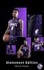
KINGS UNVEIL NEW UNIFORMS
- Thread starter Tetsujin
- Start date
I hope to see it on this page. Honestly, this selection? is pitiful. Last season's jerseys were never available.
https://www.kingsteamstore.com/sacr...150-44572+z-8-361432637?_ref=p-DLP:m-SIDE_NAV
https://www.kingsteamstore.com/sacr...150-44572+z-8-361432637?_ref=p-DLP:m-SIDE_NAV
I have a DMC one of those from the year they brought them back. Absolutely love that uni.
For many years other fans envied that jersey whenever I wore it because it wasn’t easy to find until they reused them again 7-8 years ago or however long back that was.
You’re right, they are among the best the KINGS have ever worn.
It might be time for me to upgrade my closet with one of these bad boys...New jersey looks NIIIIIIIIIIIIIIIIIIIIIIIIIIIIIIIIIIIIIIIIIIIIIIIIIIIIIIIIIIIIIIIIIIIIIIIIIIIIIIIIIIIIIIIIIIIIIIIIIIIIIIIIIIIIIIIIIIIIIIIIIIIIIIIIIIIIIIIIIIIIIIIIIIIIIIIIIIIIIIIIIIIIIIIIIIIIIIIIIIIIIIIIIIIIIIIIIIIIIIIIIIIIIIIIIIIIIIIIIIIIIIIIIIIIIIIIIIIIIICE!!!
never going to wear a jersey but I like the Statement.
I do sort of agree that the font is a choice after the new fonts. also wouldn't have minded this on a city jersey that says Beam Team instead of Kings and a solid beam around the gradient. but I mean they can improve this design if they keep them for a while? City is the only one that is a constant year to year refresh?
can someone explain the name conventions though and why they ditched home/away/alt 3rd? god I never even put this together playing 2k.
Last edited:
I never cared for the old checkerboard jerseys much but I actually really like these, except for the wording/font on the front. The K and S are way too oversized and it looks goofy. Look, if you are going to keep the larger K and S and want a block font, do something like the following instead. It is SOOO much better. And, it is proof that you can indeed use a freaking capital "N" with the rest of the capital letters. Holy cow, why is that so hard to re-implement?!?!?
And, it is proof that you can indeed use a freaking capital "N" with the rest of the capital letters. Holy cow, why is that so hard to re-implement?!?!?
Also, minor missed opportunity to make the "S" in Sacramento a larger size than the other letters and have it stand "alone" as the dot to the "i" in Kings. Man, they should have run that past me. Obviously, that would continue to irritate you because now TWO letters would be lower case!

the half and half gradient jersey now might be right up there with the black one as my favorite Kings jersey of all time. Really looks good not in weird studio lighting.
I like the color scheme, but just can't get past the Kings lettering and the tiny "Sacramento" between the K and the S. If they would have used the Kings script like in the other jerseys (or last year's) I would be liking them much more.